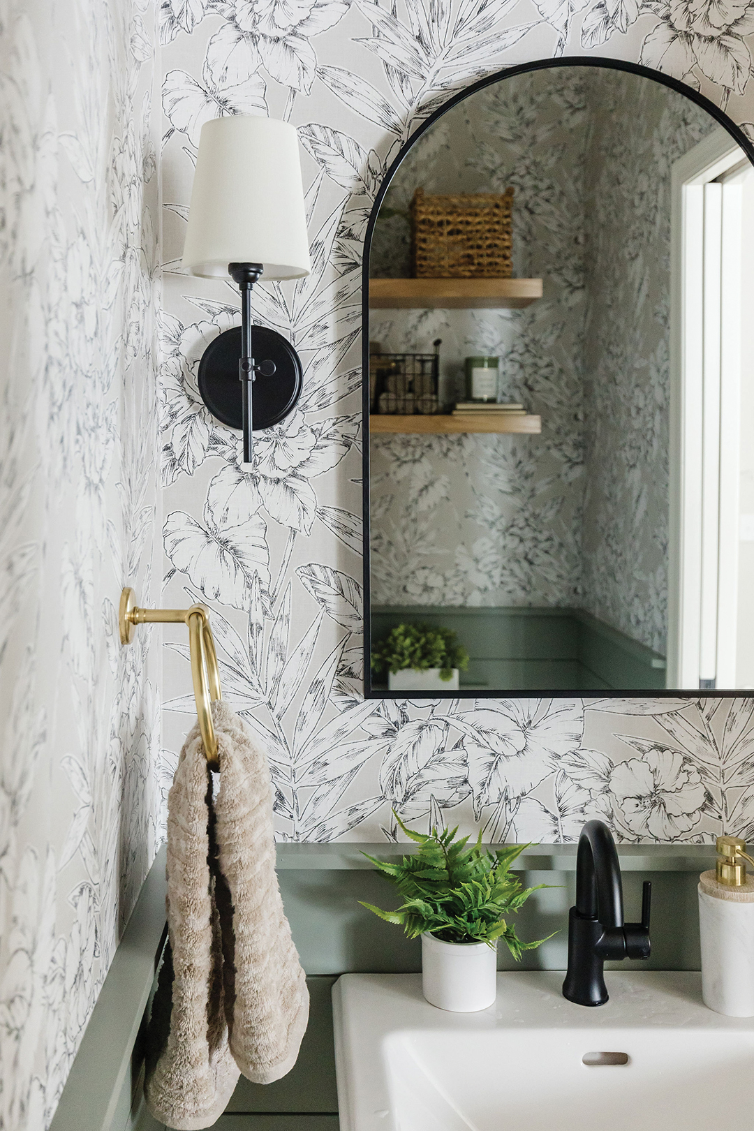
This bathroom reveals several important design trends that are on the rise, including floral wallpaper and nature-inspired tones. Photo: Kendra Denault
Texture and color are key in creating a house you call home.
When it comes to creating a relaxing home environment, an East Metro design firm has the tips and tricks.
Willow Lane Interior Design prides itself on making clients love the house they call home. Understanding that each homeowner’s likes and desires are different, the firm takes time to get to know clients’ style and preferences.
Kim Boothe, owner and interior designer, has always enjoyed making her home a space where her family can make memories. Memories created in a beautiful and functional home make them even sweeter, she says.
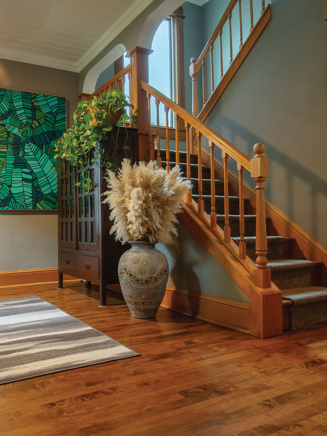
“Our lives are so busy. When we’re at home, we want reprieve from that,” she says. And to achieve that, many people turn to nature-inspired interior design. Boothe has seen a shift from the gray tones toward warmer tones, including shades of brown and taupe.
“Sustainable design is key,” Boothe says, noting it’s “in” to add finishes, fixtures and furnishings that are environmentally friendly and can improve indoor air quality.
“Plants are going to continue to be very popular to increase oxygen and improve the air quality, while getting the calmness of nature,” she says. “And natural materials like wood that is harvested sustainably also helps with that environmentally friendly element.”
Textures
Boothe says design often follows fashion trends, and right now, coziness has been a hot commodity. “… Many people turn to nature-inspired interiors to achieve a cozy feel,” she says.
When considering combining nature and design, Boothe says to think of features like natural stones, handmade tiles and warmer woods. “White oak has been having a moment, but we’re starting to see richer stains, and we return to more natural vibes,” she says. “I’m also seeing a lot of fluted details in cabinetries—so narrow ridges with a softer, rounded edge to elevate the space but still have a softness to it.”
Wallpaper continues to be popular, with floral and botanical prints on the rise. “Adding in softness with natural textures like wool, cotton and linen helps achieve that vibe, too,” she says.
Pop of Color
Boothe says major paint companies have identified blue as the color of the year. A soft pale blue gives off a serene vibe. And blue violet helps add a pop of color. (Benjamin Moore’s color of the year is Blue Nova, a soft blue-violet; Sherwin-Williams’ is Upward, a bliss-ful blue; Valspar offers Renew Blue, a bright recharging blue-green.)
Speaking of pops of color, while the earthy tones continue to dominate, vibrant colors have also been sneaking their way into design features. “I’m even seeing pink being used,” Boothe says. “I think some of that can be attributed to the Barbie movie.”
Ultimately, Boothe says trends come from how people feel and how they want to feel in their home. “We want to feel more serene and calm but with some vibrance,” she says.
Taste vs. Trend
While trends can be important when working to design a home, they aren’t always the driving feature.
“Trends are great and can be important and have their place, but I want my client’s home to reflect their life and style,” she says. “Oftentimes, I’m not always thinking about what the trends are but who my client is and what they are going to love.”
Boothe says design projects can take time, and urges everyone to trust the process and think about what interests them and how they want to feel in their home. “It’s a journey, but seeing the end result is the best reward,” she says.
Willow Lane Interior Design
Facebook: Willow Lane Interior Design
Instagram: @willowlaneinteriordesign


