Photos: Kendra Denault Photography
Woodbury home combines colors and patterns—and it just works.
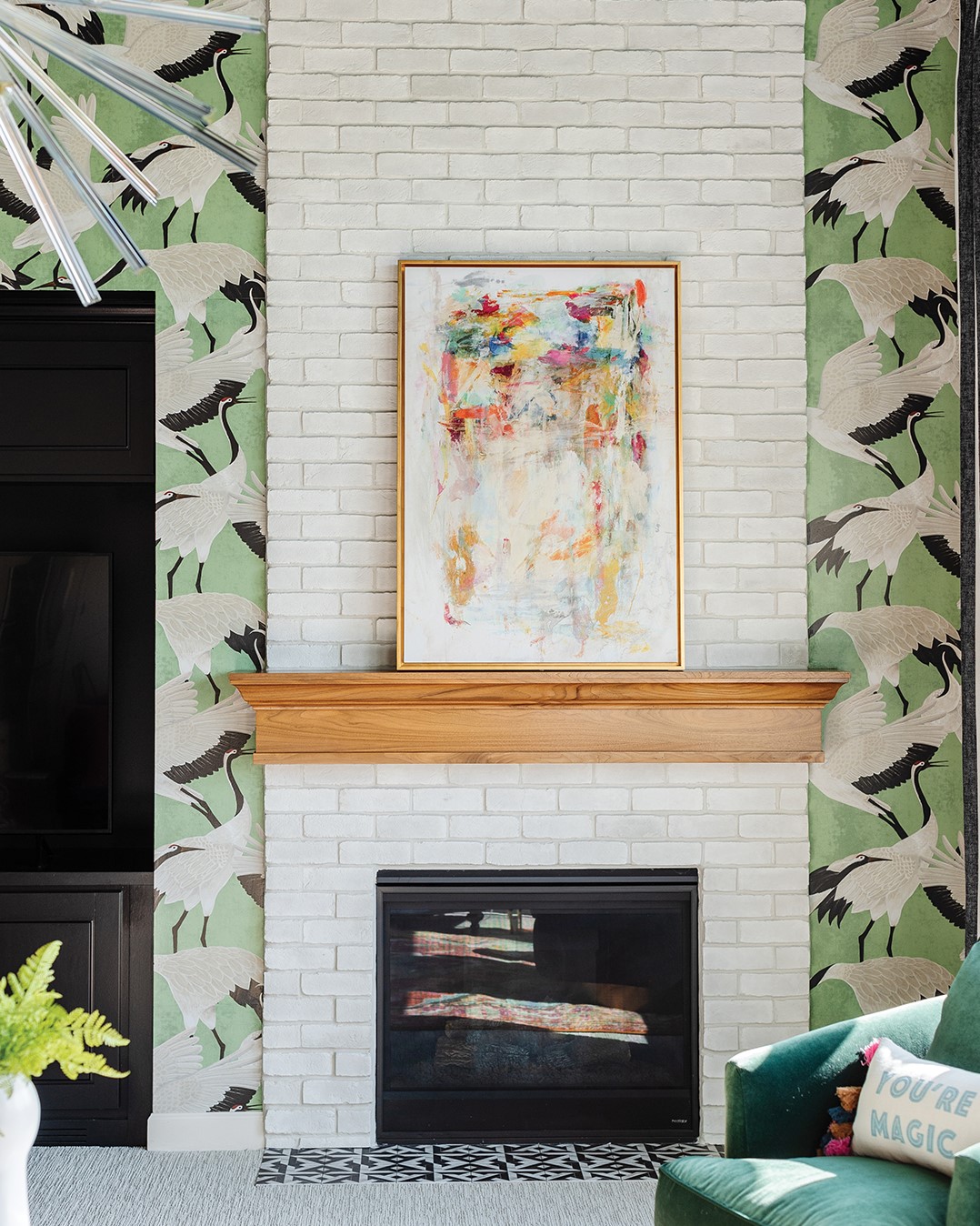
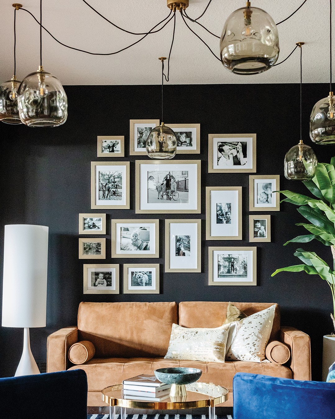
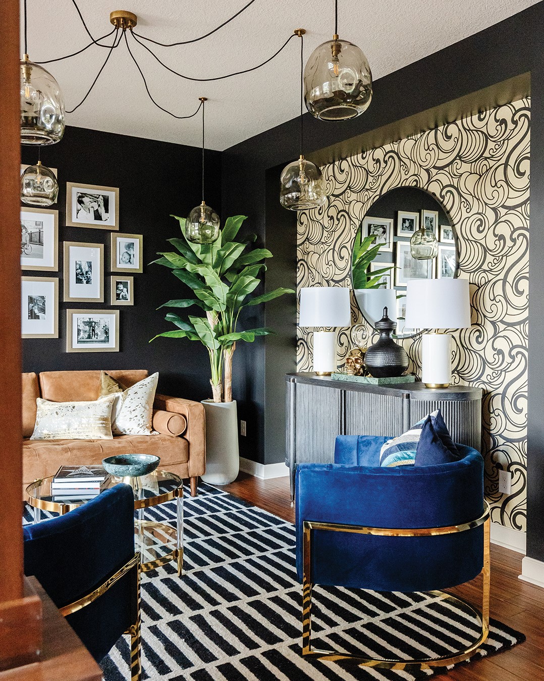
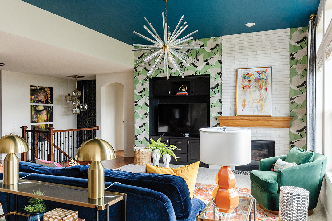
Crane wallpaper, a royal blue sofa and black walls are all part of a Woodbury home makeover that has the homeowners absolutely in awe.
Dubbed “Swanky in the Suburbs,” the home was designed by Brittany Meidinger and Shannon Knutson of Twigg + Lu Design Company. The look was based on the inspiration and input of the homeowners, Jon and Sarah Rydberg.
“It finally feels like us and this is home,” Sarah says of the house they purchased in 2014.
As a couple who prefer more eccentric, off-the-wall elements, Jon says they knew bold colors would be part of the redesign of their home. With a look and aesthetic design in mind, the Rydbergs came across a photo online that matched what they were looking for. “It had a bold color on the wall, and it caught our eye,” Jon says.
It happened to be a photo taken of a room in Meidinger’s home. The couple knew the Twigg + Lu design team could help create the look they were going for, and the rest is history.
Creative Control
While the inspiration was developed by the Rydbergs, most of the creative control was given to the Twigg + Lu team. Stepping outside the box and mixing so many colors and patterns was slightly different than what the designer was used to, but she was up for the challenge.
“I told [Meidinger] she just has to mix it all. That’s what they want,” Knutson says.
While Meidinger was the point of contact with the couple, both designers collaborated closely behind the scenes to achieve the clients’ desired look.
“We really bounce ideas off each other,” Knutson says.
Visually Stunning
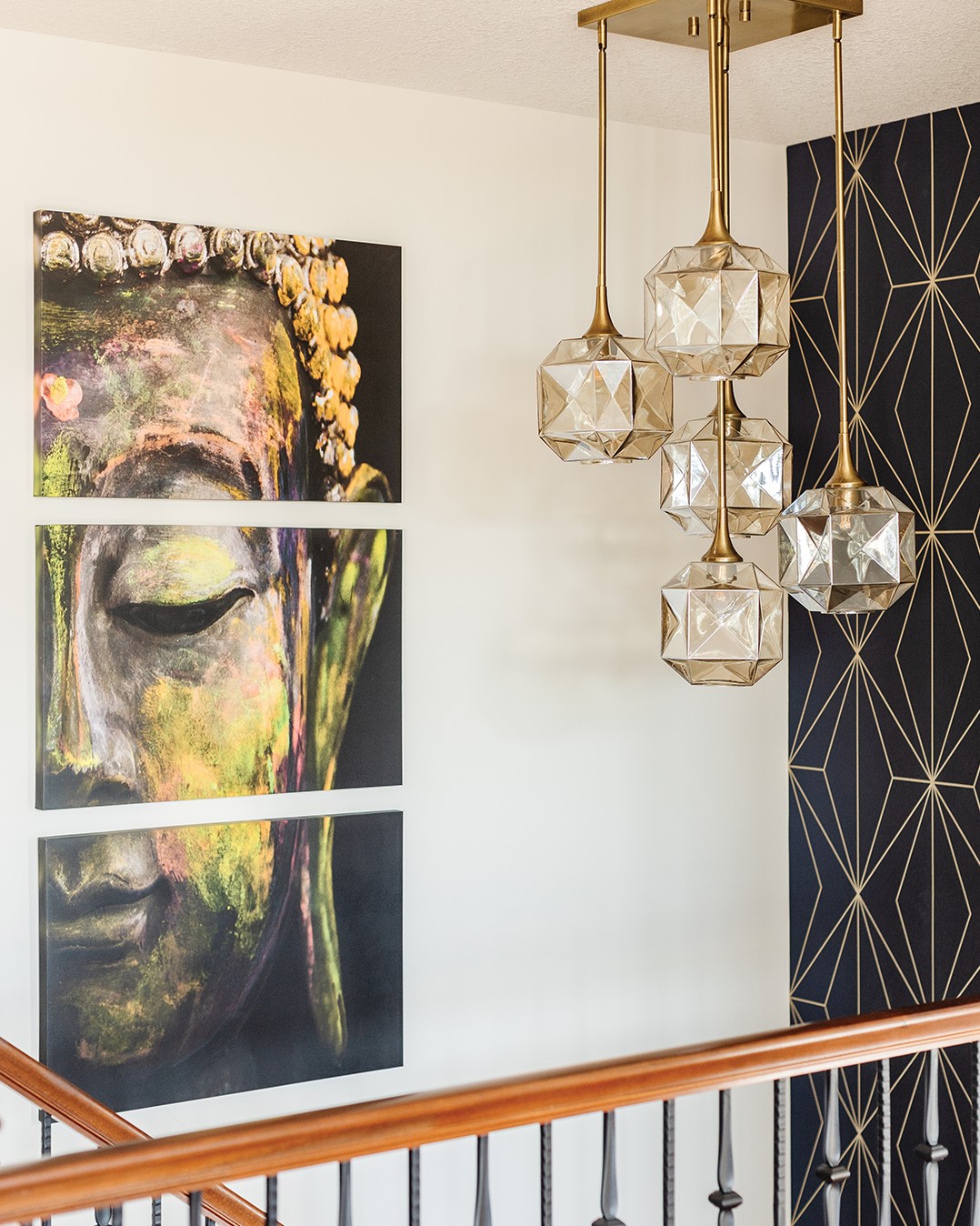
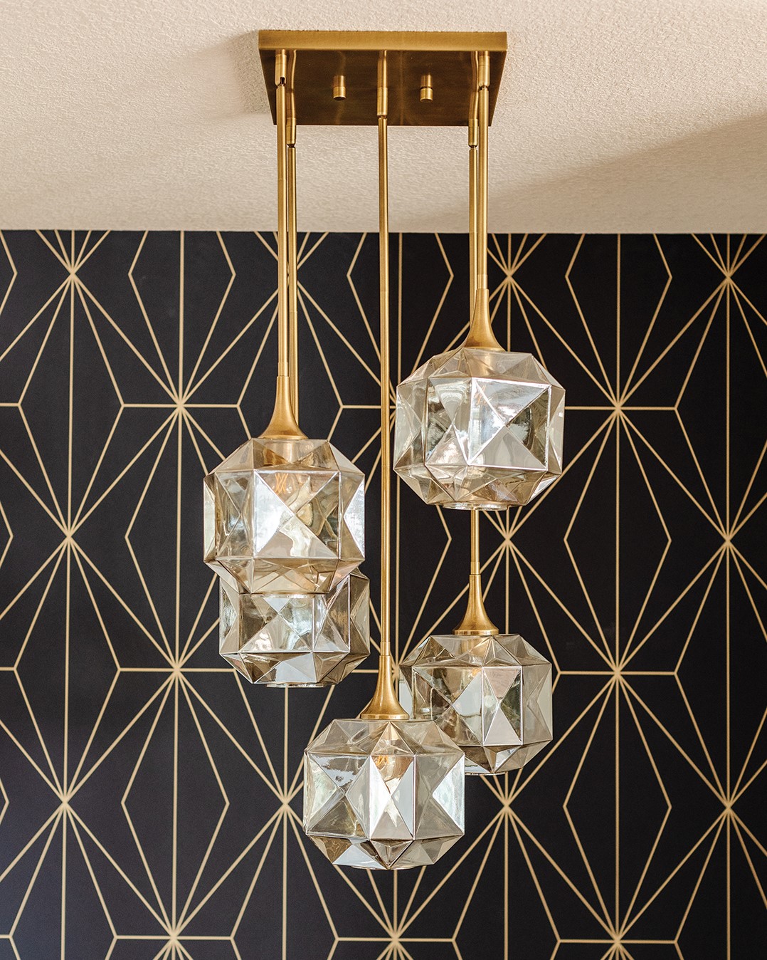
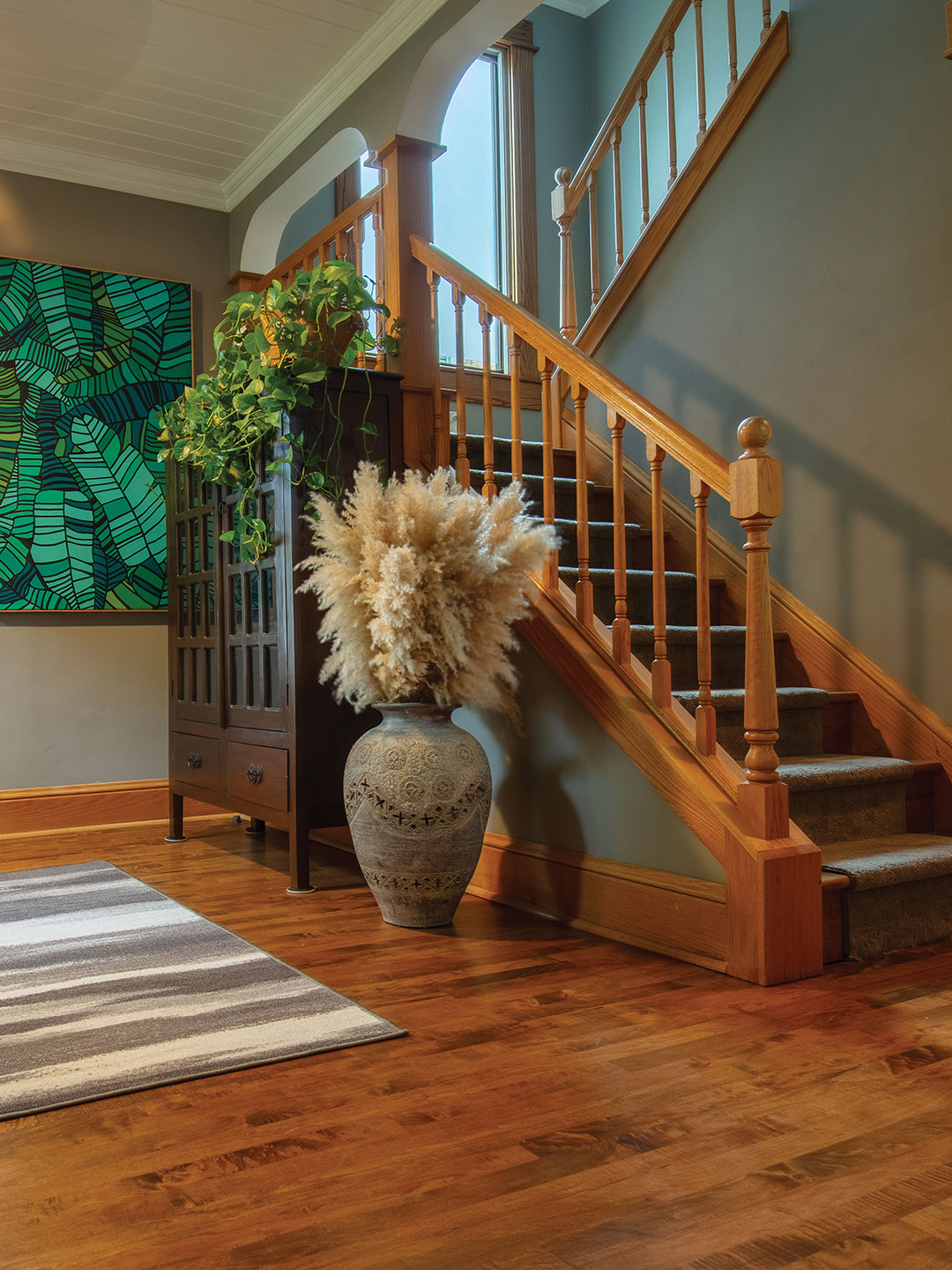
Glancing around home, multiple points of interest stand out, so much so that Jon admits it’s difficult to pick a favorite part. “I love the lights above the stairs, and I love our wall with all the music stuff,” he says.
Sarah points out her favorite part is the bedroom wallpaper. “I found it, and knew I needed to have it,” she says.
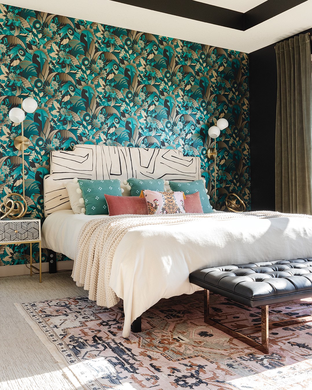
And while choosing wallpaper may seem like a small part of the project, having a bold pattern to match the rest of the room to came with challenges. “I had a lot of ideas, but I didn’t know how everything goes together, and [Meidinger] was the one who helped blend everything,” Sarah says.
“It was fun to do,” Meidinger says. “I really got to mix and match different colors and patterns.”
“They trusted the process,” Knutson says. “In the end, it really paid off and turned out great.”
Painted Ceiling
Wanting to avoid trends that would quickly date themselves, Sarah says developing a look that was different came together with a blend of Pinterest boards. “They were really good about showing us inspiration photos,” Meidinger says.
“They told [Meidinger] to just go with it, and that’s when you really get to use your imagination,” Knutson adds.
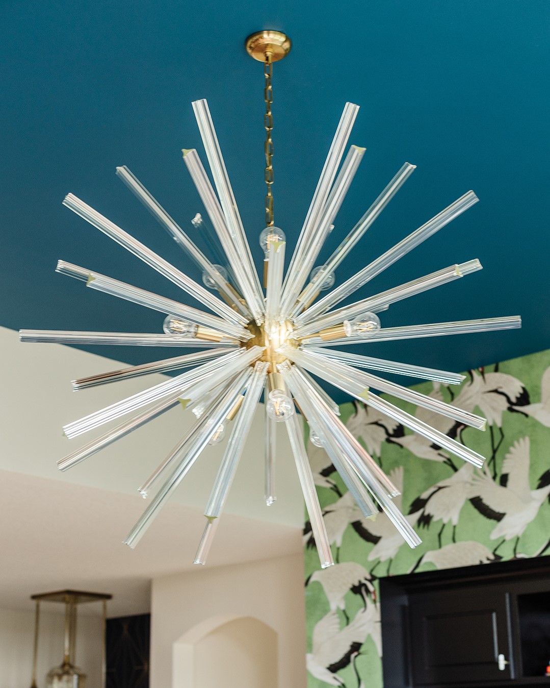
One of the designers’ favorite surprises about the project was painting the ceiling. When working with an open sitting room, walls of the adjoining kitchen started running into each other. The women needed a separation plan.
“We didn’t want to bring a bold, dramatic color into the kitchen, because we weren’t working on the kitchen,” Meidinger says. “So, we focused on the fifth wall: the ceilings … it turned out better than we could have imagined.”
The bold risks taken by both parties turned into a masterpiece the designers are proud of and the homeowners love. “They trusted the process,” Knutson says of the Rydbergs. “When you have a client who really trusts you, that’s what we love.”
About Twigg + Lu
Meidinger and Knutson met several years ago and instantly hit it off. Along came an idea to start a business together doing what they love. With any given project, clients are likely to receive a little flair from both women.
Their business name was inspired by childhood nicknames. Meidinger’s (Twiggy) was given to her by her grandfather, and Knutson’s (Lucy Brown) was given to her by her dad. They shortened the names to create Twigg + Lu.
Twigg + Lu
731 Bielenberg Drive Suite 203; 651.217.8096
Facebook: Twigg + Lu Design Co.
Instagram: @twiggandlu_designco

